


Niršanas dators Salvimar One Plus frīdaivingam un zemūdens medībām


128,50 €
Nav noliktavā
Nav noliktavā
Apraksts
Apnojas dators Salvimar ONE PLUS ir izstrādāts, lai īpaši apmierinātu visprasīgāko zemūdens medību entuziastu vajadzības.
Pēc iznākšanas uz virsmas Salvimar One Plus Frīdaivinga pulkstenis automātiski aktivizēs virsmas laika aprēķinu.
Tas saglabā visas klasiskās funkcijas no iepriekšējā modeļa:
– Laiks
– Datums
– Stundas taimeris
– Atpakaļskaitīšana
– Trauksme
– Otrā laika zona
Tāpat saglabā papildus funkcijas apnojai:
– Dziļuma mērītājs
– Virsmas laiks
– Niršanas laiks
– Atmiņa, lai saglabātu jūsu niršanas
• Bet tagad ar MILZĪGU ATJAUNINĀJUMU!
• Jauns programmatūras atjauninājums
• Padziļināta lasīšana
• Palielināts atjauninājuma ātrums
• Optimizēta akumulatora patēriņa darbība
• Atjaunināts displeja izkārtojums labākai un ātrākai lasīšanai
• Vieglāk salasāmās galvenās trauksmes
Saistītie produkti

Updated 2024 (!) user manual can be downloaded by clicking here
Scorpena Alpha is easy to use dive computer with an intuitive menu. The
device has diving, freediving, spearfishing, training and Gauge modes. User
can synchronize it with mobile devices (OS Android, iOS) using DIVE STORY
application. This app keeps a dive log, as well as allows you to change the
basic settings of the dive computer and update its software.
It is possible to set the depth of the start of dive registration from 1 to
3 meters. In this case the device automatically turns on and starts
recording the water temperature, number and time of dives, rest time at the
surface, as well as shows the greatest depth of the previous dive. In the
freediving mode it is possible to switch on the timer directly under the
water in order to record the static time.
In device settings you can set the time parameters, select the units of
depth measurement, temperature and screen backlight level. It is possible
to set which dive mode is automatically activated and after how long the
device switches to the power saving mode.
Dive modes are equipped with sound and vibration alarms, which is an
additional advantage of this device. The following alarms can be set: 5
depth alarms, 5 dive time alarms and 5 surface interval alarms. In the
spearfishing mode the screen backlight and all alarms are automatically
switched off.
Dive computer allows you to keep a logbook that registers the main
parameters of the dives: depth, temperature, duration, time and date of all
dives. In the training mode the parameters of the current dive are not
being registered in the dive logbook. Also in this mode the sound and
vibration alarms are disabled.
The device is equipped with a rechargeable lithium-ion battery (that can be
charged via cable included in the set). Fast charging technology
replenishes battery capacity by up to 85% in just 1 hour.
Dive computer is available in white and black and has impact-resistant
tempered glass. The bezel and buttons are made of stainless steel.
Specifications:
Languages: English, Russian, Spanish, Chinese.
Weight of the device with the strap: 95 grams
Approximate dimensions of the device: length 6.5 cm; width 5 cm: thickness
1.7 cm.
Strap: length 7.5+16.5 cm; width 2 cm; thickness 0.5 cm.
Case material: composite
Bezel: metal
Buttons: metal
Glass: tempered
Strap material: silicone, metal buckle
Up to 100 meters
Modes: Diving, Gauge, freediving, spearfishing, training
Air & Nitrox: Oxygen 21% ~ 56%
Lithium-ion battery (300+ charge cycles)
Fast-charging (85% in 1 hour)
Battery life: in diving mode – up to 25 dives, in standby mode – up to 3
months.
Contents:: box, device, USB charging cable, brief manual.
Noliktavā 24 prece/-es

Noliktavā 2 prece/-es

a.app__life-style {
text-decoration: none;
}
.app__render-content > p[data-v-cdde13ce] {
margin: 0;
}
.app__image__container__image {
width: 100%;
}
.app__product__link {
display: -webkit-box;
display: -ms-flexbox;
display: flex;
-webkit-box-pack: center;
-ms-flex-pack: center;
justify-content: center;
cursor: pointer;
color: #000 !important;
}
.app__product__link:hover {
color: #007cc3 !important;
}
.app__render-content > p[data-v-52867482] {
margin: 0;
}
.app__render-content > p[data-v-9d6668da] {
margin: 0;
}
.app__render-content > p[data-v-33006c09] {
margin: 0;
}
.app__render-content > p[data-v-bd6972bc] {
margin: 0;
}
.gc__banner[data-v-bd6972bc] {
padding: 1rem;
color: #fff;
background-color: #db3527;
}
.app__render-content > p[data-v-3fa3614c],
.gc__header[data-v-bd6972bc] {
margin: 0;
}
.app__render-content > p[data-v-4dc43cdc] {
margin: 0;
}
.app__render-content > p[data-v-70ba5016] {
margin: 0;
}
.gc__icon[data-v-70ba5016] {
height: auto;
}
.gc__icon–large[data-v-70ba5016],
.gc__icon–small[data-v-70ba5016] {
display: inline-block;
vertical-align: middle;
}
.gc__icon–small[data-v-70ba5016] {
height: 0.9em;
width: 1.4em;
}
.gc__icon–large[data-v-70ba5016] {
height: 2.7em;
width: 3.1em;
}
.app__render-content > p[data-v-5296f6b4] {
margin: 0;
}
.app__render-content > p[data-v-0eea5b47] {
margin: 0;
}
.image[data-v-0eea5b47] {
width: 100%;
object-fit: cover;
display: block;
max-height: 455px;
}
@media (-ms-high-contrast: none), screen and (-ms-high-contrast: active) {
.image[data-v-0eea5b47] {
max-height: 100%;
}
}
.app__render-content > p[data-v-25637a62] {
margin: 0;
}
.app__render-content > p[data-v-50345f58] {
margin: 0;
}
.gc__copy[data-v-f2ba670e] {
font-family: Roboto, Noto Sans TC, Noto Sans SC, Noto Sans JP, Noto Sans KR, Prompt, sans-serif, Microsoft JhengHei;
}
.gc__copy[data-v-f2ba670e] h1,
.gc__copy[data-v-f2ba670e] h2,
.gc__copy[data-v-f2ba670e] h3,
.gc__copy[data-v-f2ba670e] h4,
.gc__copy[data-v-f2ba670e] h5 {
font-family: Knockout30, Knockout28, Roboto, Noto Sans TC, Noto Sans SC, Noto Sans JP, Noto Sans KR, Prompt, sans-serif, Microsoft JhengHei;
}
.gc__copy[data-v-f2ba670e] h1 {
font-size: 2em;
}
.gc__copy[data-v-f2ba670e] h1,
.gc__copy[data-v-f2ba670e] h2 {
font-family: Knockout30, Knockout28, Roboto, Noto Sans TC, Noto Sans SC, Noto Sans JP, Noto Sans KR, Prompt, sans-serif, Microsoft JhengHei;
font-weight: 400;
letter-spacing: 0.05rem;
margin: 1rem 0;
}
.gc__copy[data-v-f2ba670e] h2 {
font-size: 1.5em;
}
.gc__copy[data-v-f2ba670e] h3 {
font-size: 1.25em;
}
.gc__copy[data-v-f2ba670e] h3,
.gc__copy[data-v-f2ba670e] h4 {
font-family: Knockout30, Knockout28, Roboto, Noto Sans TC, Noto Sans SC, Noto Sans JP, Noto Sans KR, Prompt, sans-serif, Microsoft JhengHei;
font-weight: 400;
letter-spacing: 0.05rem;
margin: 1rem 0;
}
.gc__copy[data-v-f2ba670e] h4 {
font-size: 1.2em;
}
.gc__copy[data-v-f2ba670e] h5 {
font-family: Knockout30, Knockout28, Roboto, Noto Sans TC, Noto Sans SC, Noto Sans JP, Noto Sans KR, Prompt, sans-serif, Microsoft JhengHei;
font-weight: 400;
letter-spacing: 0.05rem;
margin: 1rem 0;
font-size: 1.1em;
}
.app__render-content > p[data-v-f2ba670e] {
margin: 0;
}
.gc__copy[data-v-f2ba670e] h1,
.gc__copy[data-v-f2ba670e] h2,
.gc__copy[data-v-f2ba670e] h3,
.gc__copy[data-v-f2ba670e] h4,
.gc__copy[data-v-f2ba670e] h5 {
letter-spacing: 0.05rem;
margin: 1rem 0;
font-weight: 400;
}
.gc__copy[data-v-f2ba670e] h1 {
font-size: 2rem;
}
.gc__copy[data-v-f2ba670e] h2 {
font-size: 1.5rem;
}
.gc__copy[data-v-f2ba670e] h3 {
font-size: 1.25rem;
}
.gc__copy[data-v-f2ba670e] h4 {
font-size: 1rem;
}
.gc__copy[data-v-f2ba670e] h5 {
font-size: 0.9rem;
}
.gc__copy[data-v-f2ba670e] {
width: 100%;
overflow-x: auto;
}
.gc__copy–light[data-v-f2ba670e] {
color: #000;
background: 0 0;
}
.gc__copy–light a[data-v-f2ba670e]:active,
.gc__copy–light a[data-v-f2ba670e]:focus,
.gc__copy–light a[data-v-f2ba670e]:hover,
.gc__copy–light a[data-v-f2ba670e]:link,
.gc__copy–light a[data-v-f2ba670e]:visited {
color: #000;
}
.gc__copy–dark[data-v-f2ba670e] {
color: #fff;
background: #000;
}
.gc__copy–dark a[data-v-f2ba670e]:active,
.gc__copy–dark a[data-v-f2ba670e]:focus,
.gc__copy–dark a[data-v-f2ba670e]:hover,
.gc__copy–dark a[data-v-f2ba670e]:link,
.gc__copy–dark a[data-v-f2ba670e]:visited {
color: #fff;
}
.gc__copy[data-v-f2ba670e] p,
[data-v-f2ba670e] .gc__copy {
line-height: 1.25rem;
margin: 0;
}
.gc__copy[data-v-f2ba670e] p:not(:first-child),
[data-v-f2ba670e] .gc__copy:not(:first-child) {
margin: 1rem 0;
}
.gc__copy–left[data-v-f2ba670e] {
text-align: left;
}
.gc__copy–center[data-v-f2ba670e] {
text-align: center;
}
.gc__copy–right[data-v-f2ba670e] {
text-align: right;
}
.gc__copy–small[data-v-f2ba670e] {
font-size: 0.75rem;
}
.gc__copy–large[data-v-f2ba670e] {
font-size: 1rem;
}
.app__render-content > p[data-v-209e7447] {
margin: 0;
}
@keyframes loader-data-v-209e7447 {
0% {
transform: scale(0.8);
opacity: 0.3;
}
10% {
transform: scale(1);
opacity: 1;
}
to {
transform: scale(0.8);
opacity: 0.3;
}
}
.app__render-content > p[data-v-5b9e0d04] {
margin: 0;
}
.gc__card[data-v-7d9f426d] {
font-family: Roboto, Noto Sans TC, Noto Sans SC, Noto Sans JP, Noto Sans KR, Prompt, sans-serif, Microsoft JhengHei;
}
.app__render-content > p[data-v-7d9f426d] {
margin: 0;
}
.gc__card[data-v-7d9f426d] {
flex-direction: column;
justify-content: space-between;
font-weight: 400;
background: #fff;
border-radius: 3px;
width: calc(100% – 2rem);
margin: 1rem;
min-height: 0;
display: block;
}
.gc__card .dark[data-v-7d9f426d] {
background: #000;
color: #fff;
}
@media screen and (min-width: 580px) {
.gc__card[data-v-7d9f426d] {
width: calc(50% – 2rem);
}
}
@media screen and (min-width: 768px) {
.gc__card[data-v-7d9f426d] {
width: calc(33.33333% – 2rem);
}
}
@media screen and (min-width: 900px) {
.gc__card[data-v-7d9f426d] {
width: calc(25% – 2rem);
}
}
.gc__card[data-v-7d9f426d]:active,
.gc__card[data-v-7d9f426d]:hover,
.gc__card[data-v-7d9f426d]:link,
.gc__card[data-v-7d9f426d]:visited {
color: #000;
text-decoration: none;
}
.gc__card .gc__card-container[data-v-7d9f426d] {
display: flex;
flex-direction: column;
justify-content: space-between;
height: 100%;
}
.gc__card .gc__card__content[data-v-7d9f426d] {
margin: 1.5rem 1.5rem 0;
}
.gc__card .image[data-v-7d9f426d] {
width: 100%;
max-width: 100%;
height: auto;
display: block;
border-radius: 3px 3px 0 0;
}
@media (-ms-high-contrast: none), screen and (-ms-high-contrast: active) {
.gc__card .image[data-v-7d9f426d] {
max-height: 300px;
}
}
.gc__card .heading[data-v-7d9f426d] {
margin: 0.5rem 0;
}
.gc__card .gc__card-container.image-wrapper div img[data-v-7d9f426d],
.gc__card .gc__card-container.image-wrapper div[data-v-7d9f426d] {
height: 100%;
}
.app__render-content > p[data-v-0175d62f] {
margin: 0;
}
.gc__card-container[data-v-0175d62f] {
width: calc(100% – 2rem);
margin: 0 auto;
padding: 2rem 1rem;
display: flex;
flex-flow: row wrap;
justify-content: flex-start;
}
.gc__card-container–dark[data-v-0175d62f] {
background: #fff;
}
.gc__card-container–light[data-v-0175d62f] {
background: #eee;
}
.gc__card-container__center[data-v-0175d62f] {
justify-content: center;
}
.app__render-content > p[data-v-0aaa8c9f] {
margin: 0;
}
.app__render-content > p[data-v-7aa932b1] {
margin: 0;
}
.app__render-content > p[data-v-308042c3] {
margin: 0;
}
.app__render-content > p[data-v-132c8fbe] {
margin: 0;
}
.gc__icon__nav[data-v-132c8fbe] {
padding: 1rem 1.5rem;
}
.gc__icon__nav__link[data-v-132c8fbe] {
margin: 1rem 2rem 1.5rem;
}
.gc__icon__nav__link__icon[data-v-132c8fbe] {
height: 50px;
}
.app__render-content > p[data-v-6b9281c4] {
margin: 0;
}
.app__render-content > p[data-v-cefde4b6] {
margin: 0;
}
.app__render-content > p[data-v-5a233628] {
margin: 0;
}
.app__render-content > p[data-v-53039257] {
margin: 0;
}
.app__product__card__title {
font-family: Roboto, Noto Sans TC, Noto Sans SC, Noto Sans JP, Noto Sans KR, Prompt, sans-serif, Microsoft JhengHei;
}
.app__product__card {
width: 100%;
display: -webkit-box;
display: -ms-flexbox;
display: flex;
-webkit-box-align: stretch;
-ms-flex-align: stretch;
align-items: stretch;
margin-bottom: 1rem;
}
@media screen and (min-width: 768px) {
.app__product__card {
padding: 0 0.5rem;
width: 33.333%;
}
}
@media screen and (min-width: 1023px) {
.app__product__card {
padding: 0;
width: 100%;
}
}
.app__product__card__image {
width: 100%;
-ms-flex-item-align: center;
align-self: center;
}
.app__product__card__image__con {
-webkit-box-flex: 1;
-ms-flex: 1 1 auto;
flex: 1 1 auto;
max-width: 100px;
}
.app__product__card__container {
-webkit-box-flex: 1;
-ms-flex: 1 1 50%;
flex: 1 1 50%;
padding-left: 5px;
}
.app__product__card__title {
width: 100%;
text-align: left;
font-weight: 700;
font-size: 0.875rem;
padding: 0.5em 0;
color: #000;
word-break: break-word;
}
.app__product__card:hover,
.app__product__card__title:hover {
text-decoration: none;
}
.app__column-layout {
display: flex;
justify-content: center;
flex-direction: column;
flex: 1 1 auto;
}
.app__column-layout:last-child {
margin-bottom: 0;
}
.app__column-layout > * {
margin-bottom: 2rem;
box-sizing: border-box;
}
@media screen and (min-width: 768px) {
.app__column-layout {
margin-bottom: 4rem;
flex-direction: row;
}
.app__column-layout > * {
margin-bottom: 0;
padding: 0 0.5rem;
}
.app__column-layout > :first-child {
margin-left: -0.5rem;
}
.app__column-layout > :last-child {
margin-right: -0.5rem;
}
.app__column-layout:last-child {
margin-bottom: 0;
}
}
.app__column-layout__column–1 > * {
flex: 0 0 100%;
}
.app__column-layout__column–2 > * {
flex: 0 0 50%;
}
.app__column-layout__column–3 > * {
flex: 0 0 33.33333%;
}
.app__column-layout__column–4 > * {
flex: 0 0 25%;
}
.app__column-layout__column–5 > * {
flex: 0 0 20%;
}
.app__column-layout__column–6 > * {
flex: 0 0 16.66667%;
}
.app__feature__card__description {
font-family: Roboto, Noto Sans TC, Noto Sans SC, Noto Sans JP, Noto Sans KR, Prompt, sans-serif, Microsoft JhengHei;
}
.app__feature__card {
text-align: center;
}
.app__feature__card__image {
display: inline;
max-width: 100%;
margin: 0 0 0.5rem;
}
.app__feature__card__title {
text-transform: uppercase;
line-height: 1.5rem;
}
.app__feature__card h3.app__feature__card__title {
color: inherit;
}
.app__feature__card__description {
font-size: 0.875rem;
letter-spacing: 0;
line-height: 19px;
text-align: left;
margin: 0;
}
.app__layout-container {
width: 100%;
padding: 3rem 2rem;
background-color: #fff;
color: #000;
}
.app__layout-container a {
color: #000;
}
.app__layout-container > * {
margin-left: auto;
margin-right: auto;
max-width: 1200px;
}
.app__layout-container–large > * {
max-width: 100%;
}
.app__layout-container–dark {
background-color: #000;
color: #fff;
}
.app__layout-container–dark a {
color: #fff;
}
.app__img-banner__img {
width: 100%;
display: block;
}
@media screen and (min-width: 768px) {
.app__img-banner__img__mobile {
display: none;
}
}
.app__img-banner__img__desktop {
display: none;
}
@media screen and (min-width: 768px) {
.app__img-banner__img__desktop {
display: block;
}
}
.app__life-style {
position: relative;
display: block;
background-color: #000;
}
@media screen and (min-width: 768px) {
.app__life-style {
background-color: transparent;
}
}
.app__life-style__img-con {
background-color: #000;
}
.app__life-style__text {
line-height: 1;
margin: 0;
color: inherit;
}
.app__life-style__text__con {
color: #fff;
text-shadow: 0 0 0.5em #000;
text-align: center;
font-family: Knockout30, Knockout28;
padding: 2rem;
margin: 0;
width: 100%;
}
.app__life-style__text__con__mobile–bottom {
position: absolute;
bottom: 0;
}
.app__life-style__text__con__mobile–left {
text-align: left;
}
.app__life-style__text__con__mobile–center {
text-align: center;
}
.app__life-style__text__con__mobile–right {
text-align: right;
}
.app__life-style__text__con__mobile–bottom {
-webkit-font-smoothing: antialiased;
-moz-osx-font-smoothing: grayscale;
}
@media screen and (min-width: 768px) {
.app__life-style__text__con {
width: 35%;
position: absolute;
top: 50%;
transform: translateY(-50%);
text-align: left;
padding: 0 0 0 2rem;
}
.app__life-style__text__con__mobile–center,
.app__life-style__text__con__mobile–left,
.app__life-style__text__con__mobile–right {
text-align: unset;
}
.app__life-style__text__con__mobile–bottom {
-webkit-font-smoothing: unset;
-moz-osx-font-smoothing: unset;
bottom: unset;
}
.app__life-style__text__con–right {
text-align: right;
right: 0;
padding: 0 4rem 0 0;
}
.app__life-style__text__con–center {
text-align: center;
padding: 0;
left: 50%;
width: 50%;
transform: translate(-50%, -50%);
}
}
.app__life-style–light .app__life-style__text__con {
color: #000;
text-shadow: 0 0 0.5em #fff;
}
.app__video-banner {
position: relative;
background-color: #000;
}
.app__video-banner__video {
background-color: #000;
pointer-events: auto;
position: absolute;
top: 0;
left: 0;
width: 100%;
height: 100%;
display: flex;
flex-wrap: wrap;
z-index: 2;
}
.app__video-banner__video__play-bt {
font-size: 1.8rem;
opacity: 0.5;
transition: opacity 0.2s;
cursor: pointer;
position: absolute;
top: 50%;
left: 50%;
transform: translate(-50%, -50%);
}
.app__video-banner__video__play-bt:hover {
opacity: 1;
}
.app__video-banner–light {
background: #fff;
}
.app__overview__intro__title {
text-transform: uppercase;
max-width: 900px;
}
.app__overview__intro .app__overview__intro__title {
margin-left: auto;
margin-right: auto;
margin-top: 0;
}
.app__overview__intro__description {
text-align: center;
margin-bottom: 3rem;
max-width: 900px;
}
.app__overview__intro__icons {
flex-wrap: wrap;
}
@media screen and (min-width: 480px) {
.app__overview__intro__icons {
flex-direction: row;
}
}
.app__overview__intro__icons .app__feature__card__description {
text-align: center;
}
.app__overview__intro__icons > * {
flex: 0 0 100%;
}
@media screen and (min-width: 480px) {
.app__overview__intro__icons > * {
flex-basis: 50%;
padding: 0 0.5rem;
}
.app__overview__intro__icons > :first-child {
margin-left: -0.5rem;
}
.app__overview__intro__icons > :last-child {
margin-right: -0.5rem;
}
}
@media screen and (min-width: 768px) {
.app__overview__intro__icons > * {
flex-basis: 16.66667%;
}
}
.app__product__copy__title {
margin-left: auto;
margin-right: auto;
margin-top: 0;
}
.app__product__copy__description {
margin-bottom: 1.5rem;
}
.app__product__copy–dark {
background-color: #000;
}
.app__tabs__content {
padding-top: 7em;
margin-top: -4.7em;
display: -webkit-box;
display: -ms-flexbox;
display: flex;
-ms-flex-wrap: wrap;
flex-wrap: wrap;
font-size: 14px;
max-width: 1170px;
width: 100%;
margin-left: auto;
margin-right: auto;
min-height: 600px;
}
@media screen and (min-width: 768px) {
.app__tabs__content {
padding: 7em 5.15em 2em;
}
}
.app__tabs__content__main {
width: 100%;
}
@media screen and (min-width: 1023px) {
.app__tabs__content__main {
width: 70%;
}
}
.app__tabs__content__main img {
max-width: 100%;
height: auto;
}
.app__tabs__content__main:last-of-type .app__tabs__content__link {
border-bottom: 1px solid #dcdcdc;
}
.app__tabs__content__link {
cursor: pointer;
display: -webkit-box;
display: -ms-flexbox;
display: flex;
color: #000;
padding: 1.5em 2em;
margin: 0;
font-size: 1em;
font-weight: 600;
letter-spacing: 0.02em;
text-transform: uppercase;
border-top: 1px solid #dcdcdc;
}
.app__tabs__content__link–active {
color: #000;
border-bottom: 1px solid #dcdcdc;
}
.app__tabs__content__link__icon {
height: 20px;
display: -webkit-box;
display: -ms-flexbox;
display: flex;
margin-left: auto;
}
.app__tabs__content__link–active .app__tabs__content__link__icon–plus,
.app__tabs__content__link__icon–minus {
display: none;
}
.app__tabs__content__link–active .app__tabs__content__link__icon–minus {
display: -webkit-box;
display: -ms-flexbox;
display: flex;
}
@media screen and (min-width: 768px) {
.app__tabs__content__link {
display: none;
border: none;
color: #000;
background-color: transparent;
}
}
.app__tabs__content__wrap {
max-height: 0;
padding: 2em;
width: 100%;
min-height: 1px;
overflow: visible;
max-height: unset;
}
@media screen and (min-width: 768px) {
.app__tabs__content__wrap {
padding: 0;
}
}
.app__tabs__content__wrap a {
color: #007bc1;
}
.app__tabs__content__wrap img {
max-width: 100%;
height: auto;
}
@media screen and (min-width: 768px) {
.app__tabs__content__wrap {
max-height: none;
-webkit-transition: max-height 2s;
transition: max-height 2s;
}
}
.app__tabs__content__full .app__tabs__content__main {
width: 100%;
}
.app__tabs__content__full {
font-size: 16px;
}
.app__tabs__content__full a {
color: #000;
text-decoration: underline;
}
.app__render-content > p[data-v-ea32da5c] {
margin: 0;
}
.app__render-content > p {
margin: 0;
}
#app {
font-family: Avenir, Helvetica, Arial, sans-serif;
-webkit-font-smoothing: antialiased;
-moz-osx-font-smoothing: grayscale;
text-align: center;
color: #2c3e50;
}
.app__product {
position: relative;
display: -webkit-box;
display: -ms-flexbox;
display: flex;
-webkit-box-orient: horizontal;
-webkit-box-direction: normal;
-ms-flex-flow: row wrap;
flex-flow: row wrap;
padding-bottom: 1em;
}
@media screen and (min-width: 1023px) {
.app__product {
margin-top: 2em;
-webkit-box-orient: horizontal;
-webkit-box-direction: normal;
-ms-flex-flow: row nowrap;
flex-flow: row nowrap;
}
}
.app__banner__mobile {
-webkit-box-pack: center;
-ms-flex-pack: center;
justify-content: center;
display: -webkit-box;
display: -ms-flexbox;
display: flex;
margin-bottom: 2em;
}
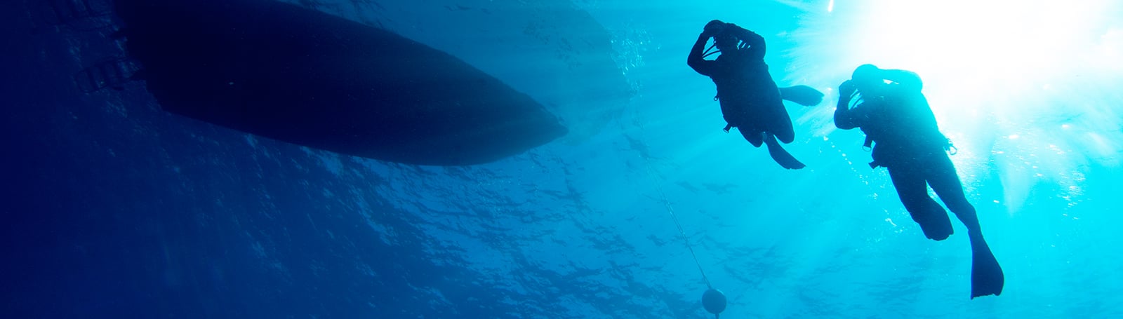
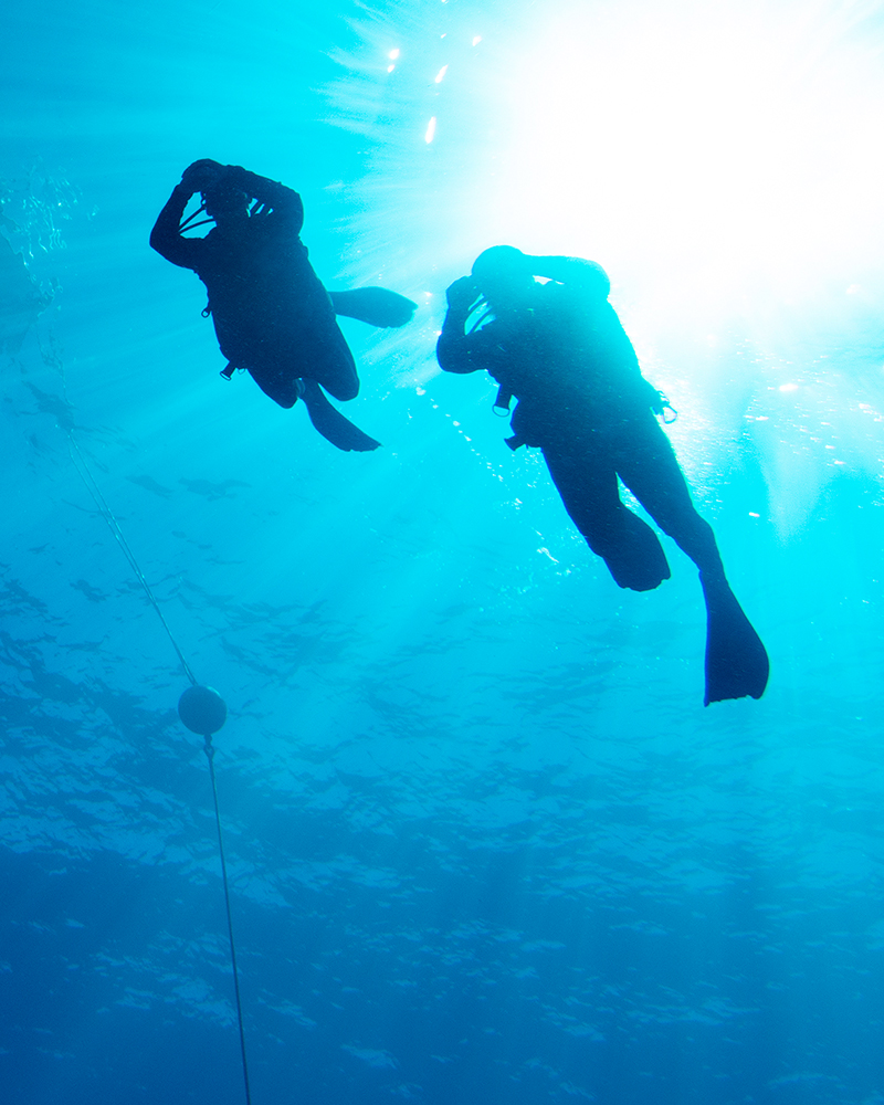
THE DIVE COMPUTER FOR BOTH YOUR WORLDS
This is the advanced, watch-style dive computer that comes with multisport training and smart features. If you want air integration, take a look at Descent Mk2i.
Choose from multiple dive modes for your underwater adventure.
Measure your performance, and track your stats above water.
More sports apps, such as golfing and skiing, mean more ways to play.
This smart dive computer features Garmin Pay™, music and notifications.
Share and review dives in the Garmin Dive™ app.
The battery in your Garmin device is simply unmatched by other smartwatches.
Plunge to a whole new depth of capability.
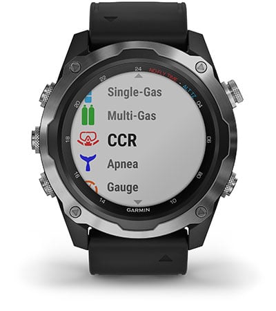
DIVE MODES
Get multiple dive modes for single and multiple gas dives (including nitrox and trimix), gauge, apnea, apnea hunt and closed-circuit rebreather.
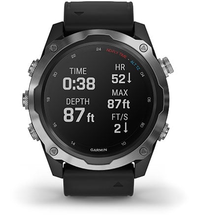
CUSTOMIZABLE DIVE MODES
Add additional screens for each dive mode that features the fields you want to see.
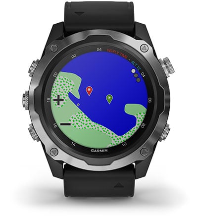
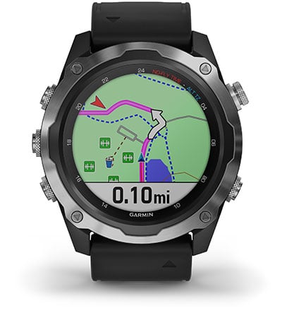
SURFACE MULTI-GNSS
Track your entry and exit1 points with advanced satellite connectivity.
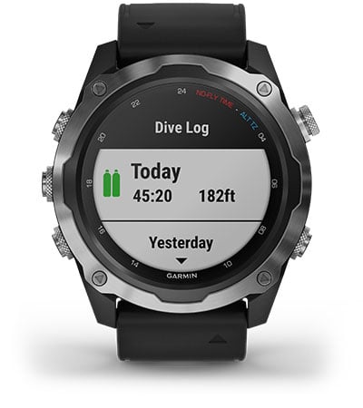
DIVE LOG
Store and review data for up to 200 dives — and share via the Garmin Dive app.
INREACH® COMPATIBLE
Pair with inReach satellite communicators and the inReach dive case.
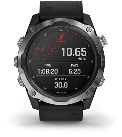
PERFORMANCE METRICS
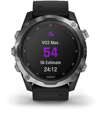
View advanced training metrics that include running dynamics, heat- and altitude-adjusted VO2 max, recovery advisor and more2.
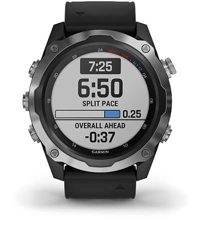
PACEPRO™ TECHNOLOGY
A first-of-its-kind feature helps keep you on pace with grade-adjusted guidance as you run a course.
SPORTS APPS
Use preloaded activity profiles for trail running, swimming, running, biking, hiking, rowing, skiing, golfing and more.
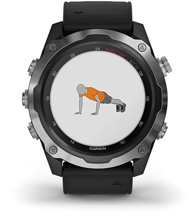
ANIMATED WORKOUTS
Easily follow animated workouts for cardio, strength, yoga and Pilates. View workouts right on your watch screen.
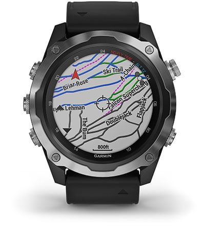
TOPO AND SKI MAPS
Use topographical maps to navigate your adventures and view run names and difficulty ratings for 2,000 worldwide ski resorts.
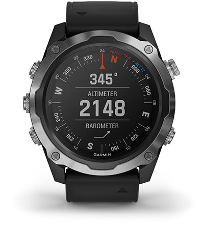
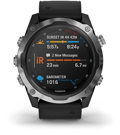
ABC SURFACE SENSORS
Navigate your next trail with ABC sensors, including an altimeter for elevation data, barometer to monitor weather and 3-axis compass.
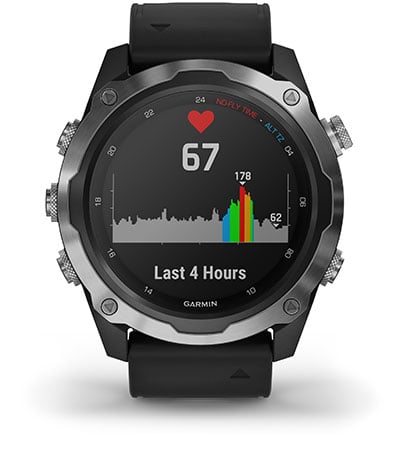
WRIST-BASED HEART RATE
Optical heart rate2 technology gauges activity intensity as well as heart rate variability to calculate your stress level. It also tracks underwater without a heart rate strap.
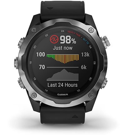
PULSE OX SENSOR
For altitude acclimation or sleep monitoring, a Pulse Ox3 sensor uses light beams at your wrist to gauge how well your body is absorbing oxygen.
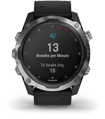
ALL DAY RESPIRATION
Track how you’re breathing throughout the day, during sleep and during breathwork and activities such as yoga.
TURN-BY-TURN NAVIGATION
Follow a route or course with help from turn-by-turn directions, which let you know ahead of time when the next turn is coming.
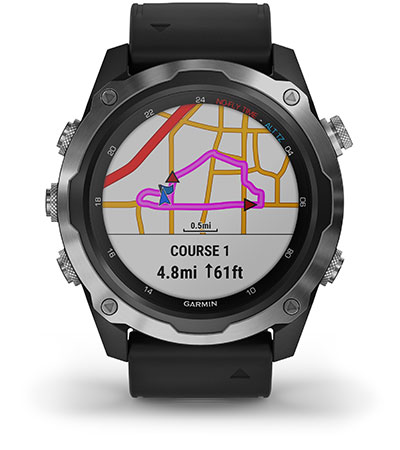
ROUND-TRIP ROUTING
Enter a distance you want to travel, and get suggested routes that will bring you back to your starting point. Trendline™ popularity routing helps you find the best local paths.
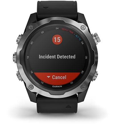
SAFETY AND TRACKING FEATURES
If you feel unsafe or if your watch senses an incident, assistance and incident detection features4 send your location to emergency services. Feature not available while in dive mode.
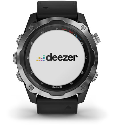
MUSIC
Store up to 2,000 songs, or access streaming music apps from your compatible services5, including Spotify®, Deezer and Amazon Music.
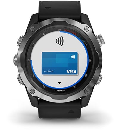
GARMIN PAY™ CONTACTLESS PAYMENTS
Breeze through checkout lines with Garmin Pay contactless payment solution6 through participating providers.

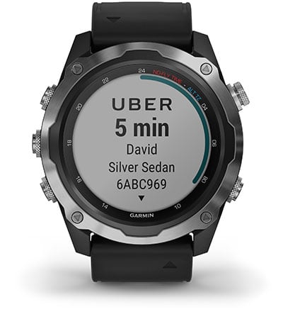
SMART NOTIFICATIONS
Receive emails, texts and alerts right on your wrist when paired with a compatible device.
CONNECT IQ™ STORE
Download custom watch faces, add data fields, and get apps and widgets from the Connect IQ Store.
Noliktavā 2 prece/-es

Noliktavā 3 prece/-es

Noliktavā 1 prece/-es


Noliktavā 1 prece/-es

Updated 2024 (!) user manual can be downloaded by clicking here
Scorpena Alpha is easy to use dive computer with an intuitive menu. The
device has diving, freediving, spearfishing, training and Gauge modes. User
can synchronize it with mobile devices (OS Android, iOS) using DIVE STORY
application. This app keeps a dive log, as well as allows you to change the
basic settings of the dive computer and update its software.
It is possible to set the depth of the start of dive registration from 1 to
3 meters. In this case the device automatically turns on and starts
recording the water temperature, number and time of dives, rest time at the
surface, as well as shows the greatest depth of the previous dive. In the
freediving mode it is possible to switch on the timer directly under the
water in order to record the static time.
In device settings you can set the time parameters, select the units of
depth measurement, temperature and screen backlight level. It is possible
to set which dive mode is automatically activated and after how long the
device switches to the power saving mode.
Dive modes are equipped with sound and vibration alarms, which is an
additional advantage of this device. The following alarms can be set: 5
depth alarms, 5 dive time alarms and 5 surface interval alarms. In the
spearfishing mode the screen backlight and all alarms are automatically
switched off.
Dive computer allows you to keep a logbook that registers the main
parameters of the dives: depth, temperature, duration, time and date of all
dives. In the training mode the parameters of the current dive are not
being registered in the dive logbook. Also in this mode the sound and
vibration alarms are disabled.
The device is equipped with a rechargeable lithium-ion battery (that can be
charged via cable included in the set). Fast charging technology
replenishes battery capacity by up to 85% in just 1 hour.
Dive computer is available in white and black and has impact-resistant
tempered glass. The bezel and buttons are made of stainless steel.
Specifications:
Languages: English, Russian, Spanish, Chinese.
Weight of the device with the strap: 95 grams
Approximate dimensions of the device: length 6.5 cm; width 5 cm: thickness
1.7 cm.
Strap: length 7.5+16.5 cm; width 2 cm; thickness 0.5 cm.
Case material: composite
Bezel: metal
Buttons: metal
Glass: tempered
Strap material: silicone, metal buckle
Up to 100 meters
Modes: Diving, Gauge, freediving, spearfishing, training
Air & Nitrox: Oxygen 21% ~ 56%
Lithium-ion battery (300+ charge cycles)
Fast-charging (85% in 1 hour)
Battery life: in diving mode – up to 25 dives, in standby mode – up to 3
months.
Contents:: box, device, USB charging cable, brief manual.
Noliktavā 47 prece/-es
 Google